Hey there! Ever found yourself in need of a quick and easy way to make your space a little safer? Maybe you’ve got a slippery floor, a tricky step, or just want to keep everyone on their toes (literally). That’s where our free printable “Watch Your Step” signs come in handy. Our website is a treasure trove of free printable assets, perfect for anyone looking to add a dash of practicality to their environment without spending a dime.
What’s even better is that you get unlimited downloads, so you can print as many signs as you need. Whether it’s for your home, office, or a public event, these signs are perfect for personal use and sharing with others. So, why wait? Dive into our collection and start printing your way to a safer, more aware space today!
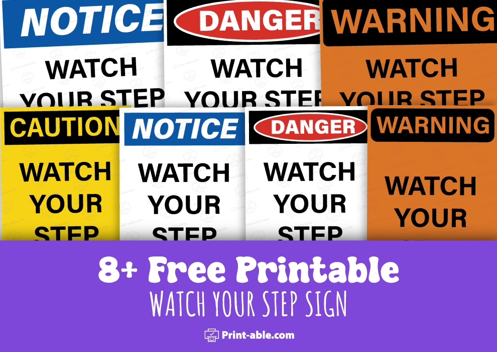
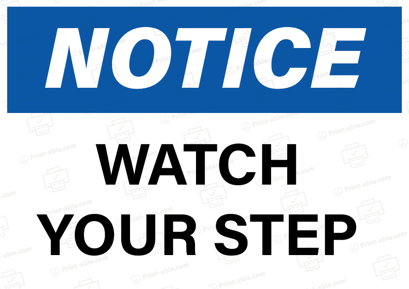
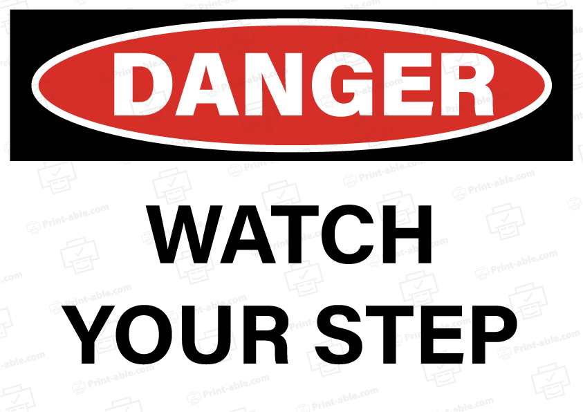
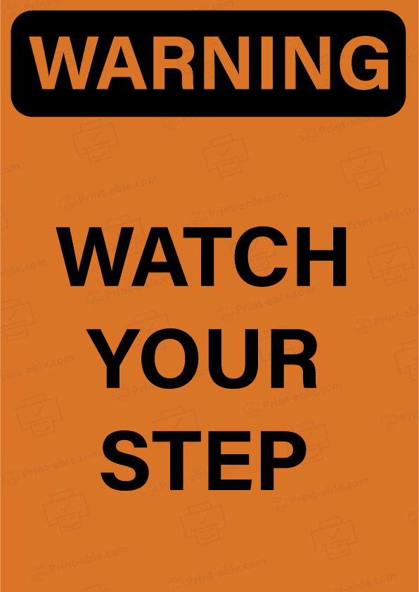
Watch Your Step Sign Free Download
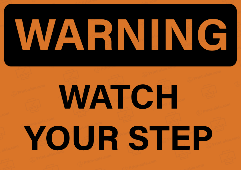
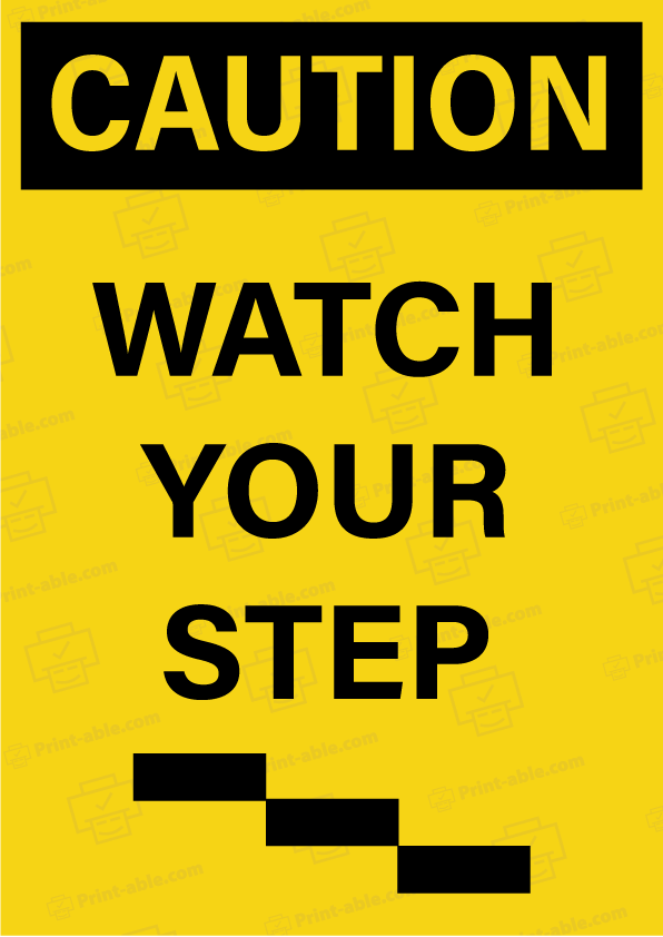
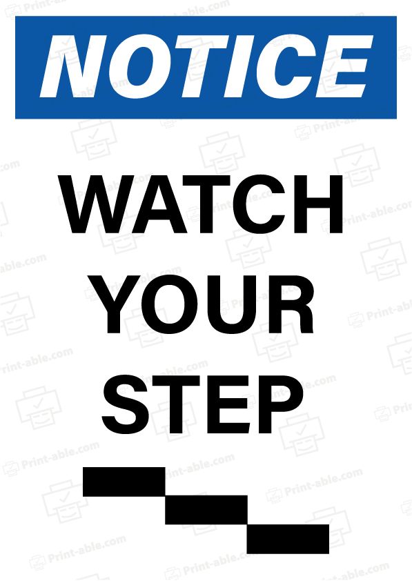
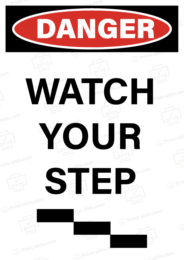
Creating a watch your step sign printable can significantly enhance safety in areas with potential tripping hazards. Having a clear, visible sign can prevent accidents and ensure that people are aware of their surroundings. This is especially useful in workplaces, event locations, and any area with uneven ground or obstacles.
You can easily print a custom sign to suit your specific needs, whether it’s for a temporary situation or a permanent fixture. There are many online resources and templates available that can be customized to include specific warnings or logos.
Incorporating such signs into your safety protocol demonstrates a proactive approach to accident prevention. This small but crucial step can be the difference between a safe environment and one prone to injuries.
Designing Your ‘Watch Your Step’ Sign
Color and Contrast
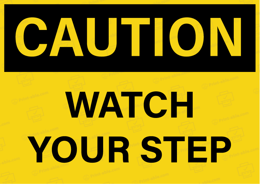
Effective use of color and contrast ensures your sign stands out. High contrast, such as black text on a yellow background, is crucial for readability.
- Background Colors: Consider vibrant colors like yellow, orange, or red for the background to grab attention.
- Text Colors: Use contrasting colors like black or white against bright backgrounds to make the text easily readable.
- Consistency: Keep color schemes consistent with other safety signs to avoid confusion.
Font Selection and Size
Choosing the right font and size plays a vital role in legibility. Simple, sans-serif fonts like Arial or Helvetica are ideal.
- Font Style: Avoid decorative fonts; they can be hard to read from a distance.
- Text Size: For clarity, ensure the text is large enough to be read at a glance. A minimum of 1-inch letter height for every 10 feet of distance is recommended.
- Boldness: Utilize bold fonts to enhance visibility.
Symbol Usage
Symbols convey messages quickly and effectively. Incorporating a clear symbol related to the message can increase comprehension.
- Common Symbols: Use recognizable symbols, such as an exclamation mark inside a triangle, to indicate caution.
- Placement: Position symbols to the left or above the text for natural eye flow.
- Size and Clarity: Ensure symbols are large and clear enough to be seen from a distance.
Printing and Placement Tips
Knowing how to print and place your “Watch Your Step” sign ensures it remains durable, visible, and compliant with safety standards. This not only prevents accidents but also fulfills regulatory requirements.
Material Choices for Durability
Choose materials that withstand the environment where the sign will be placed. Laminated paper is inexpensive but suitable only for indoor, low-traffic areas. Plastic signs offer more durability and are water-resistant. Metal signs, such as aluminum, are excellent for outdoor use and high-traffic areas due to their robustness and resistance to weather.
Below is a brief comparison:
| Material | Durability | Environment |
|---|---|---|
| Laminated Paper | Low | Indoor |
| Plastic | Medium | Indoor/Outdoor |
| Metal (Aluminum) | High | Outdoor/High Traffic |
Make sure the printing method matches the material. Inkjet printers work well for paper, but laser printers and vinyl cutters are better for plastic and metal.
Effective Placement for Visibility
Place signs at eye level to ensure they are noticed promptly. For example, at the top or bottom of staircases, near entryways, and close to hazards. Put signs in places with good lighting so they’re visible in all conditions.
If the area is prone to clutter, consider placing signs higher but still within view. Ensure no obstacles block the line of sight. For larger areas, multiple signs may be necessary to cover all angles and entry points.
Use bold fonts and bright colors for better readability. Yellow and black are standard for caution signs due to their high visibility.
Maintaining Safety Compliance
Following local and national safety regulations is crucial. Refer to standards like OSHA for guidelines on sign dimensions, wording, and placement. Regular inspections are necessary to ensure signs remain in good condition and visible.
Replace any signs that show wear and tear immediately. Laminated paper might need more frequent replacements, whereas metal and plastic signs are longer-lasting.
Document the placement and maintenance of signs to stay compliant. This can help in both planned audits and unexpected inspections.
By following these tips, your “Watch Your Step” signs will be effective in promoting safety and compliance.