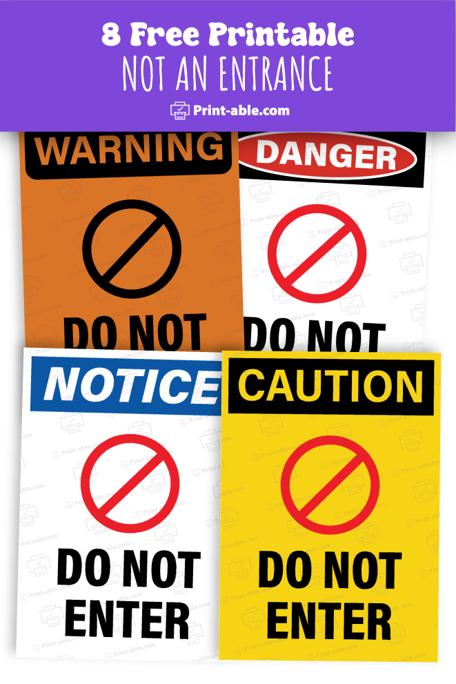
When managing a space, clarity in signage is crucial. Sometimes, you need a sign that clearly communicates that an area is not an entrance, preventing confusion and ensuring smooth navigation in your facility. A Not an Entrance sign can help direct traffic efficiently and maintain order.
Finding a printable version can save time and allow for easy customization to fit your specific needs. You can download and print a sign tailored to your aesthetic preferences and requirements, making it simple and convenient to implement immediately.
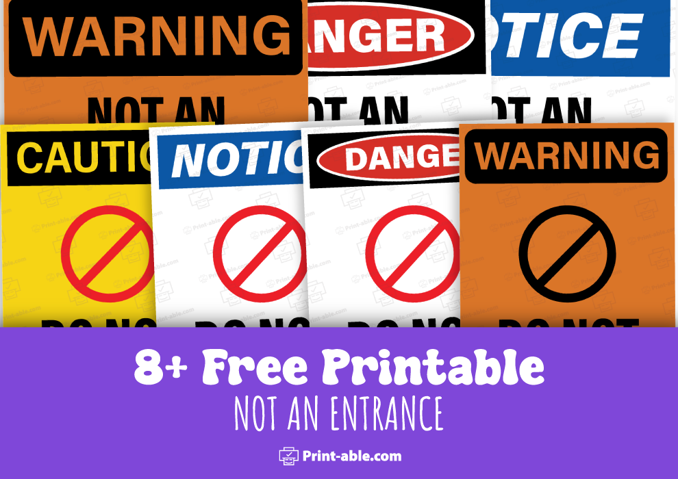
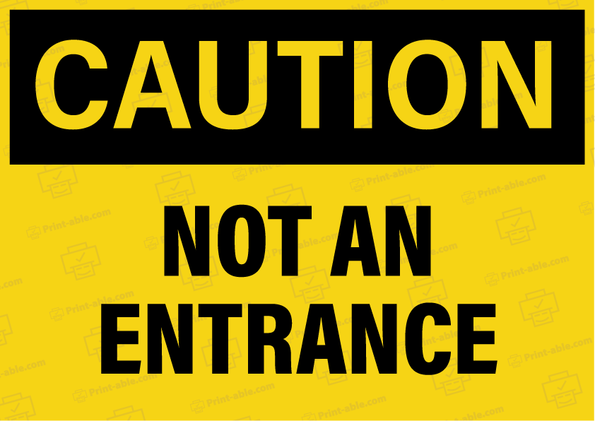
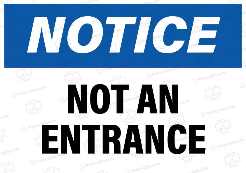
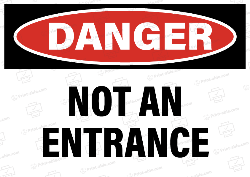
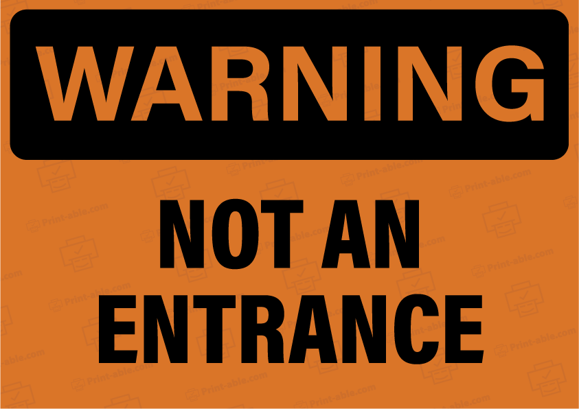
Not An Entrance Sign Free Download


Designing Your ‘Not an Entrance’ Sign
When planning your “Not an Entrance” sign, focus on ensuring it is clear, noticeable, and easily understood. Key considerations include the layout, size, color scheme, text, typography, and the inclusion of symbols or graphics.
Sign Layout and Size
Proper layout and size are critical. Decide on a format that accommodates all necessary elements without looking cluttered.
Common sizes:
- Small: 12″ x 18″
- Medium: 18″ x 24″
- Large: 24″ x 36″
Make sure text and symbols are appropriately spaced. The sign should be readable from the intended viewing distance, with larger signs for greater distances.
Color Schemes and Visibility
Choosing the right colors enhances visibility. High-contrast colors like black and white or red and white are effective.
Recommended combinations:
- Background: White
- Text: Black
- Accents: Red or Yellow
Bright colors help grab attention. Use reflective materials for better night visibility. Ensure the sign doesn’t blend into the surroundings.
Text and Typography
Clarity in text is paramount. Use simple language and direct terms.
Best practices:
- Font: Bold, sans-serif (e.g., Arial, Helvetica)
- Size: Ensure letters are large enough to read from a distance
- Text: “NOT AN ENTRANCE”
Avoid italic or overly decorative fonts. Ensure proper spacing between words for readability.
Symbols and Graphics
Incorporate clear and universally understood symbols. These can quickly convey the message even without reading the text.
Common symbols:
- No Entry: Red circle with a white bar
- Arrows: To indicate direction
Place symbols at the top or next to the text for immediate recognition. Ensure they are large enough to be seen from a distance.
Printing and Placement Instructions
When creating a “Not an Entrance” sign, you need to select durable materials, adjust printer settings for optimal quality, and follow legal guidelines for placement.
Material Selection for Durability
Choose materials that can withstand weather conditions and wear. PVC, aluminum, and heavy-duty plastic are good options. These materials resist fading and damage from UV rays, rain, and wind.
For indoor use, consider laminated paper or cardstock. Ensure the material is thick enough to avoid tearing.
Using self-adhesive vinyl is beneficial if you need the sign to stick to various surfaces like walls or doors. It’s waterproof and durable.
Printer Settings and Quality
Proper printer settings ensure the sign’s readability and professional appearance. Use a high-resolution setting, typically 300 dpi or higher. This ensures clear, crisp text and images.
Select the appropriate paper type setting in your printer software, such as “Glossy Paper” for glossy finishes or “Matte Paper” for non-glare surfaces.
For larger signs, consider wide-format printers. Ensure ink levels are adequate to avoid faded prints. If using a home printer, adjust color settings for true-to-life colors.
Legal Compliance and Placement Guidelines
You must comply with local regulations when placing signs. Check specific city or county ordinances. Some areas have size, color, and placement requirements.
Place signs at eye level for maximum visibility. Situate signs at points where they prevent unauthorized entry effectively. Doorways, gates, and restricted areas are typical locations.
Ensure the sign is visible from a distance. Use contrasting colors to make the text stand out. Avoid obstruction by trees, poles, or other objects.